VLC for Android Redesign
Design System Information ArchitectureIn this post I'm only covering a small part of the project. If you want to learn more about how I work: Here's my general process.
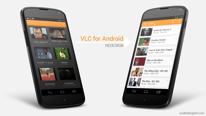
Left: Old design; Right: New design in Android Holo Style (2013)
The VLC player is one of the most used media players on desktop computers with over 100 Million users.
The challenge
Unfortunately the Android version was at the time of this project still in beta and didn't look and feel native enough so this was a perfect project to practice on. My goal/challenge was to make an intuitive playlist, restructure the navigation and update the design.
The process
I looked at several music player apps and typical list interactions on smartphones (for the playlist). Furthermore I analyzed the structure and flow of audio libraries (especially the one on the iPod). I made a lot of wireframes and finally the high fidelity mockups you'll see below. The following points were important to me as a user:
- Clean coherent structure with easy access to all features
- Logical music library interaction
- Native Android design
User Feedback
Below you find my solutions. After posting the original redesign I got a lot of user feedback on reddit (was on the /r/Android front page) and Google+ and incorporated the feedback into the next mockups.
The result
After I posted my redesign of the VLC Player for Android in May 2013 it got picked up by the VideoLAN team and we worked on it together. About a year later the implementation started and the stable release followed soon after.
New Mini Player and Playlist Interaction
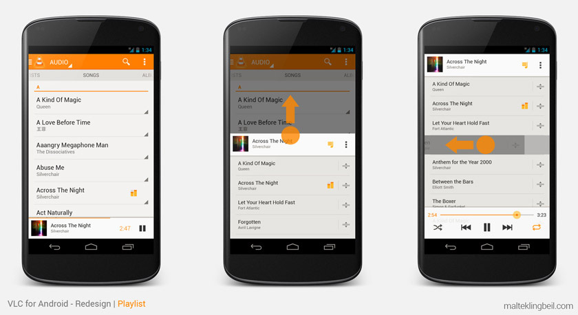
- To have better access to the player keep it visible all the time
- A quick swipe up will open the playlist from anywhere in the app
- To remove an item just swipe it left or right
- Reorder items by simply dragging them around in the playlist
Slide-out-menu
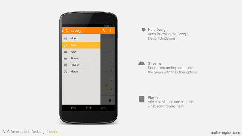
The slide-out menu just got more popular at this time and it was a perfect place to collect different features - the menu was there before but the features were still not all gathered in this one place. In order to keep the interface clean and well-structured every media type (audio, video, stream, etc.) should be accessible from the same place. Moving the streaming option from the action bar to the menu and thereby placing it with the other same level elements.
Video Library
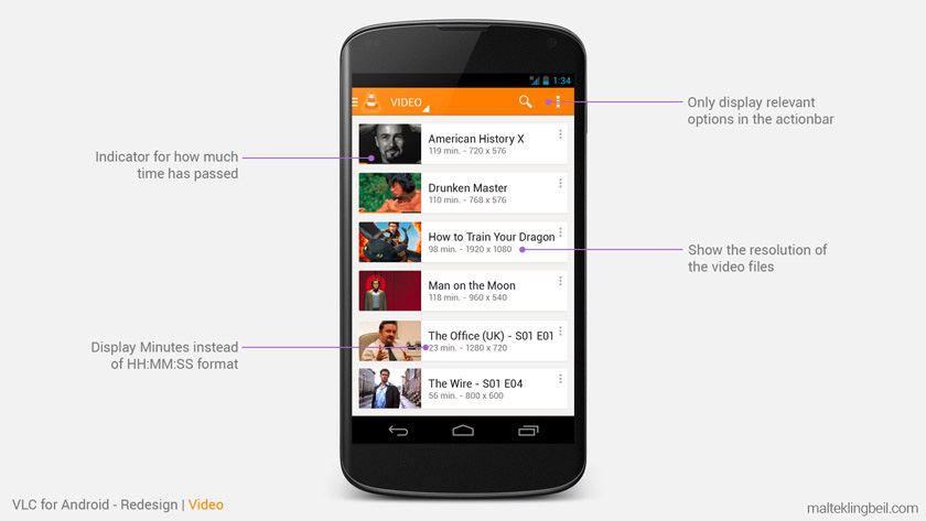
- A clear list structure to easily navigate and search movies
- Use industry standard (minutes) to display time
- Show the resolution of the video file
Video Player
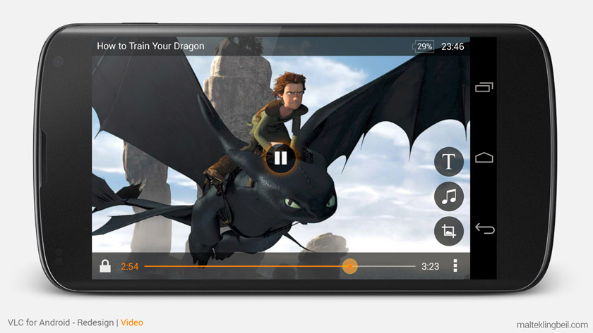
- Remove unnecessary elements and show as much of the screen as possible
- Make the screen lock always accessible
- Additional features may stack up on the right site
Audio Library
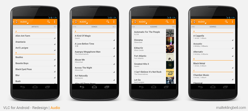
- Artists: Display just the names of the artists for a clean overview (no distracting unrelated album covers)
- Songs: Title and artist should be enough information here
- Albums: Album title, the artist and a fancy album thumbnail - if the list is rather short drop the abc separators
- Genres: Display the genres and show how many artists and albums are included in each genre
Artist Selection Flow
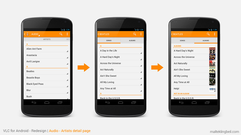
- Once you select an artist the next step is to either select a specific song or an album
- If an album is selected show all the songs from that album