Enhancing TeamViewer feature discoverability
Discoverability Flow optimizationIn this post I'm only covering a small part of the project. If you want to learn more about how I work: Here's my general process.
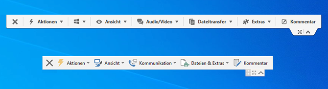
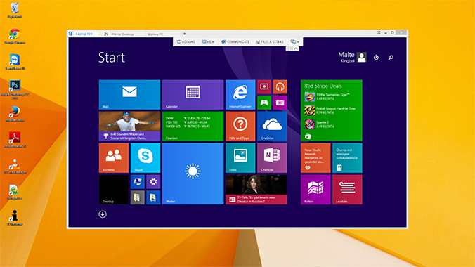
Top: Old design; Bottom: New design
Abstract: This project took about three months. Including ideation, mockups, prototyping, user testing and finally implementation. The project was started as users kept asking about features that were already implemented but hard to find in the former menu structure.
In this project I was wearing a lot of different hats. Doing the research, moderating test sessions, coordination external designers for the icons and finally being the product owner working together with the developer over several short sprints to implement the new toolbar.
The challenge
I was given the task to improve the old toolbar as the support team dealt with more and more tickets regarding features requests. A lot of users - especially new users - were struggling to find the features they needed in the cascading menu structure.
Not only were the features hard to find they were also not arranged in a logical order. So, in order to find something, you had to open every menu individually and look through the options.
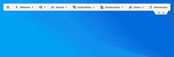
This was the old menu with normal dropdowns that would include further dropdowns
The process
Well, I first tried to understand the current elements present in the toolbar. I noted all elements down and then looked at the existing clusters (given by the dropdown header names). After that I tried to redefine the existing clusters.
For this I worked together with the product managers. We did some card sorting and finally arrived at the following Venn diagram showing the items that overlapped. These were hard to sort into specific categories so we choose to just pick one and see if users would find them.
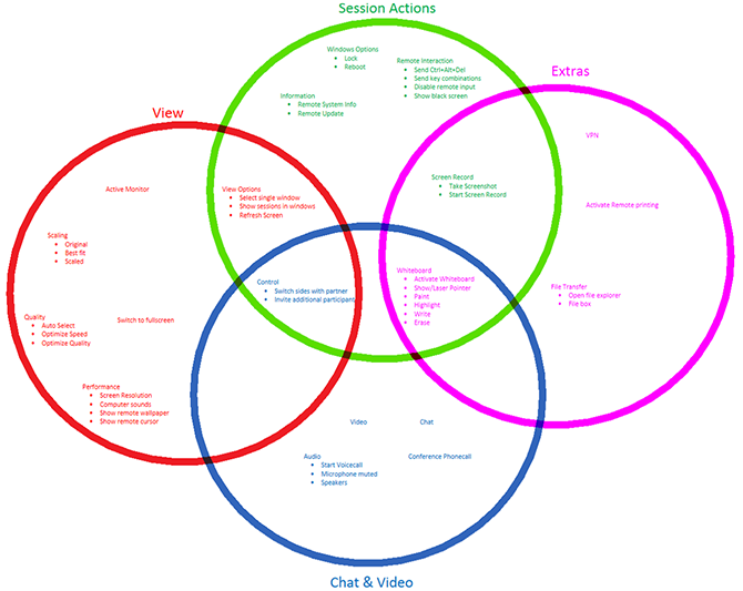
A Venn diagram showing all available options
Microsoft research documentation
We tried quite a few different versions for a menu but in the end, we didn't want to reinvent the wheel so we took some inspiration from Microsoft and their introduction of the Ribbon.
As I was the only UX designer at the company at that time it was quite helpful that Microsoft documented a lot of the research process and how it was perceived by the users.
For example, the video above "The Story of the Ribbon" was a great insight into what they tried. And we could learn from that.
Although we adopted our version were needed as we wanted to block as little space as possible. Our menu was always overlaying the remote screen video. So, we adapted our version accordingly.
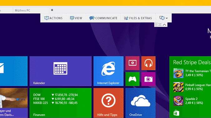
The new menu in the prototype
Change aversion
Of course, we knew that not everyone would like this new interface. But we were prepared. The biggest struggle was to convince existing users that the new layout would help them. New users just adapted without problem.
This comes down to experience and expectation. Users that were used to the old layout already had quite some experience with it and for them every change meant that we weren't doing what they expected. New users didn't have any expectations and would most likely know the style already from Office so there was no big struggle.
As there is already quite some information out there in regards to dealing with changes, I won't go into detail here. If you are curious to learn more about change aversion, I can recommend this article from Aaron Sedley.
Interactive prototype
After some iterations I started to build a highly interactive prototype and planned and moderated a usability test in order to see how users liked it. The reactions were overall really positive and nothing stood in the way of implementation.
As the prototype was quite detailed it was a great deliverable for the developer as well and could be implemented in a short amount of time. And in regards to the mouse behavior we were also inspired by the trick Amazon uses to .
Click the image to open the prototype.
(Doesn't work on mobile, this was optimized for a 1400px width screen resolution.)